Free Monochrome Coloring Pages — Printable One-Color Designs for Adults
Choosing colors from a full set is its own kind of work — and when you sit down to color after a long day, the last thing you need is another set of decisions. Monochrome coloring removes that entirely. One color. Everything else is just how light or how dark. These ten free printable monochrome coloring pages are designed for adult colorists who want something that feels calm rather than complicated — no palette planning, no color theory, no second-guessing. Download, print, and reach for one pen or one pencil. That's it. Scroll down to see the pages and find out which one to start with.
Monochrome Coloring Pages
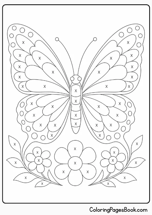
The wing panels on this butterfly are divided into large, clearly bounded sections — ideal for practicing value variation, where you shade each panel slightly differently to give the wings a sense of curve and light. Try working the outer wing edges darker and leaving the central areas lighter, as if light is hitting the butterfly from above; a few passes of a colored pencil at increasing pressure is all it takes.
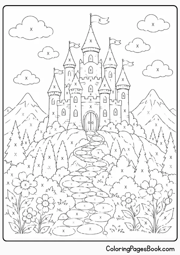
Stone architecture rewards monochrome treatment because stonework naturally reads as a series of planes at different angles to a light source — some catching light, some in deep shadow. Use the stonework divisions as your guide: horizontal surfaces lighter, vertical recesses darker, with the sky kept at a near-white tone to make the castle silhouette read sharply against it.
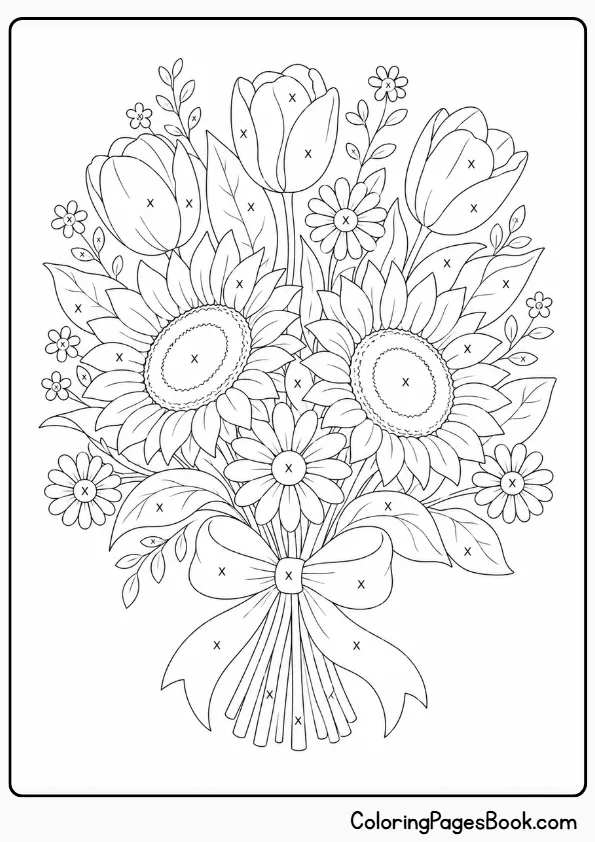
Floral subjects with overlapping petals give you a built-in shading logic — wherever one petal passes behind another, that section drops a value. Start with a light pass over the entire bouquet before committing to any darks, then deepen the areas where petals overlap or tuck inward; this is where colored pencils outperform markers, because the layering mimics the soft gradations in actual petals.
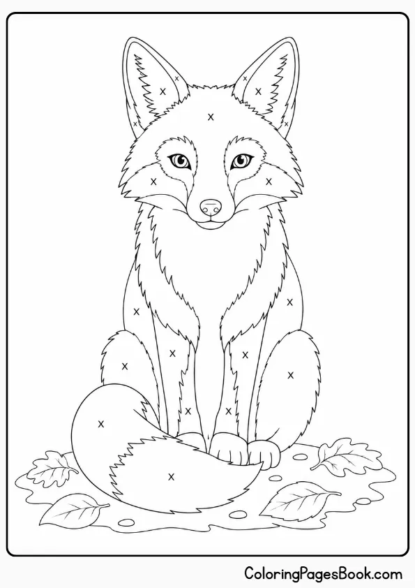
Fox fur moves in a consistent direction — outward from the spine, forward across the face — which gives you a built-in stroke map for the entire image. Concentrate your darkest values along the ridge of the back and into the ear shadow areas, and let the chest and muzzle fade toward your lightest tone; the contrast creates the fox’s characteristic pale-fronted silhouette without requiring precise planning.
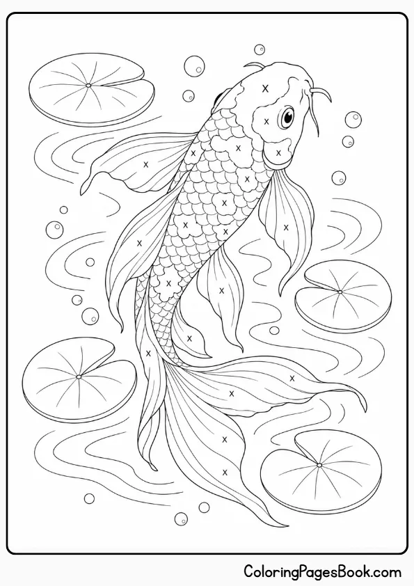
Scales are one of the most forgiving textures for a first monochrome attempt — the structure of each scale gives you a natural directional stroke to follow, and slight value variation between adjacent scales creates depth without requiring precise tonal planning. Alcohol markers work particularly well here because they blend smoothly across the curved scale surfaces, especially in the deep water areas at the image’s edges where you want maximum ink density.
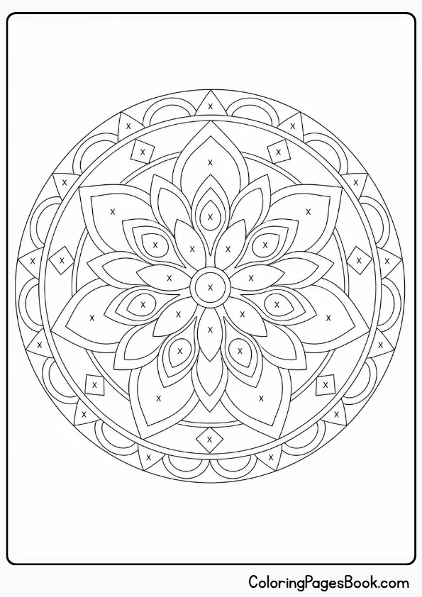
Unlike the organic subjects on this page, a mandala has no inherent texture cues telling you where light falls — so this one asks you to make a deliberate decision: pick an imaginary light source (top-left is conventional) and consistently shade elements that face away from it darker. It’s more of a planning exercise than the other pages, and it’s a good one to attempt after you’ve worked through one or two of the animal designs.
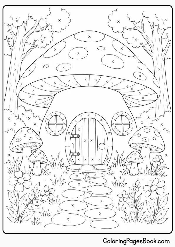
The appeal of this image in monochrome is the contrast between organic shapes — the rounded cap, the overgrown foliage — and the hard architectural lines of the cottage itself. Shade the mushroom cap with directional strokes that follow its curve, and treat the cottage walls with flatter, more even coverage; that textural difference between the two halves is what makes the image read as dimensional rather than flat.
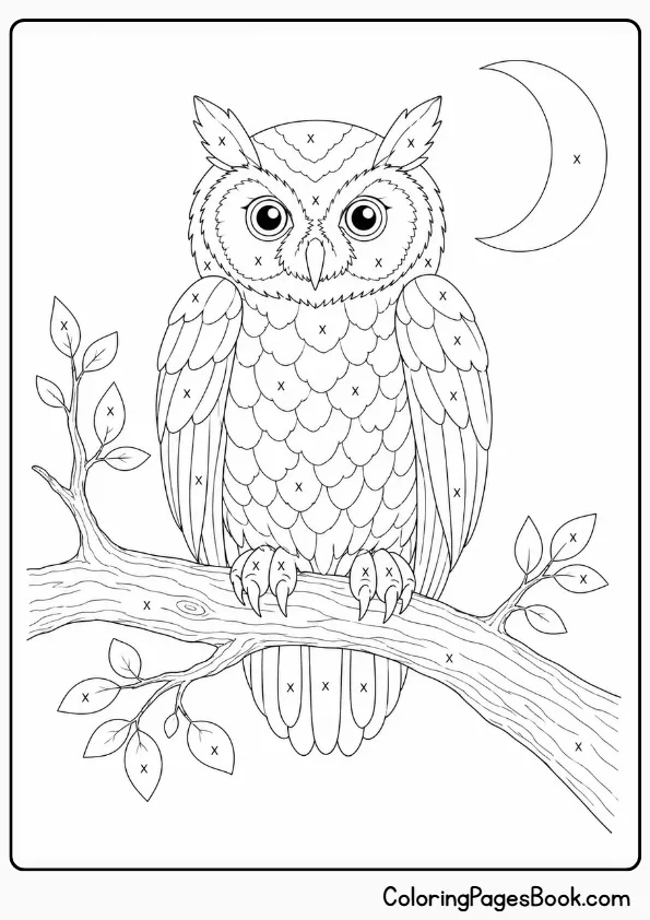
Feathers work exactly the way fur does for pencil coloring: short strokes in the direction the feathers lie produce a convincing texture without requiring fine detail work. Concentrate your darkest values around the owl’s facial disc — the ring of feathers framing the eyes — and keep the chest feathers light; this mirrors how light typically catches an owl’s pale front plumage and creates an immediate sense of three-dimensional form.
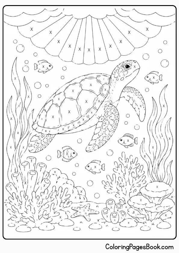
Depth is the natural subject here, and the water column gives you a readymade value gradient: darkest at the outer edges and lower depths, lightest near the surface where light penetrates. Alcohol markers handle large underwater background areas better than pencil — the smooth, even coverage reads as water in a way that visible pencil texture doesn’t.
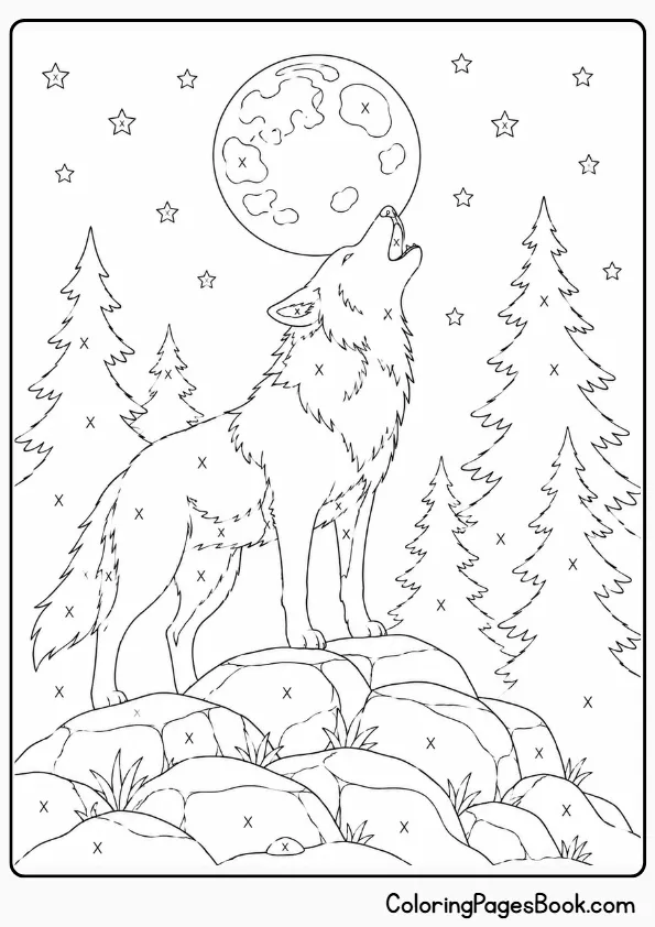
This is the most forgiving page in this collection for a first attempt — the wolf’s fur provides a clear directional guide for every pencil stroke, and the subject’s natural contrast (dark back and shoulders, lighter chest and muzzle) gives you a built-in value map to follow. Start with a light pass across the entire coat, then layer the back and shadow areas progressively darker; the chest can stay close to your lightest tone throughout.
Related Coloring Pages
Popular Coloring Pages


What Is Monochrome Coloring?
Monochrome coloring is a technique where you fill an image using one color in varying tones — from its lightest shade to its darkest. It isn’t limited to black and white; you can use any single color. Depth comes from varying pressure or ink density rather than switching colors, creating form through light and shadow alone.
That distinction — one hue, varied tone — matters more than it sounds. In regular coloring, you use different colors to separate different areas of an image. In monochrome coloring, you use value: the relative lightness or darkness of your single color. This forces you to pay attention to light sources, shadow depth, and contrast in a way that multi-color work rarely demands.
The technique has a name with serious pedigree. Grisaille — from the French word for gray — is a centuries-old painting method that uses exactly this principle: tonal variation within a single color to create the illusion of three dimensions. Jan van Eyck used it on the Ghent Altarpiece to make flat painted figures look like carved stone. The underlying logic is the same whether you’re working on a Renaissance panel or a printable fox coloring page.
And the bold-outline format these pages use isn’t arbitrary. Early European woodcuts from the 1460s and 1470s were, according to Met Museum records on printmaking history, explicitly designed to be colored by hand — their thick outlines and minimal interior shading were engineered for exactly this purpose. The pages on this site follow the same structural logic, and they work for the same reason: clear boundaries let you navigate an entire image with a single color without any section losing definition.
How to Color a Monochrome Coloring Page
Each page has small X marks inside certain sections — those are the areas you fill with your chosen color. Sections without an X mark stay white. That’s the complete method: pick one dark color, fill every X-marked section, leave everything else untouched. The finished page reads as a two-tone graphic print — your color against white — and the contrast is the whole effect.
What You Actually Need to Start Monochrome Coloring
You don’t need a gray-scale marker set to start. A single colored pencil — one that you probably already own — contains more tonal range than most beginners ever use. Varying your pressure from near-weightless to full hand-pressure produces at least five distinct tonal steps from one pencil. The beginner’s instinct is to press hard from the start; that’s the one thing to resist, because once you’ve saturated the paper’s surface with heavy pressure, it physically can’t accept more pigment. Light first, dark later — always.
If you want markers, the alcohol vs. water-based distinction matters. Alcohol markers — Copic, Ohuhu, and similar — blend beautifully and produce smooth, even coverage, which makes them excellent for the landscape and underwater designs on this page. The catch: alcohol ink bleeds straight through standard 80gsm printer paper. If you’re printing these pages at home and plan to use alcohol markers, print on at minimum 200gsm card stock, or use X-Press It Blending Card, which is the professional standard. Don’t skip this step and expect it to go well.
Water-based markers like Tombow Dual Brush Pens are the more forgiving choice for home printing — they won’t bleed through standard paper, and a 10-piece grayscale Tombow set covers the full tonal range at a fraction of the cost of a comparable Copic selection. The trade-off is that large flat areas can show streaking, but for organic subjects with built-in texture — the owl, wolf, fox — that variation actually adds to the result rather than detracting from it.
One underrated tool worth having: a blending stump (also called a tortillon) for pencil work, or a colorless blender pencil if you’re using waxy colored pencils like Prismacolors. Both tools push pigment into the paper surface rather than adding more color. That lets you smooth tonal transitions and soften gradient zones in ways a single pencil can’t do on its own.
How to Get the Most From One Color
Light to Dark — Without Exception
Start with the lightest possible pressure across the entire area you're filling, then build depth through successive layers at increasing pressure. This isn't just technique advice — it's a physical constraint. Colored pencil pigment fills the paper's tooth (the micro-texture that holds pigment), and once you've pressed hard, there's nowhere left for subsequent layers to adhere. You can always go darker; you can't go lighter once the surface is saturated. This one principle, applied consistently, is the difference between monochrome work that looks dimensional and work that looks flat.
Find the Light Source Before You Start
Before making a single mark, decide where the light is coming from. Top-left is conventional and works for most of the images on this page. Once you've picked it, every surface facing toward that point stays lighter; every surface angling away goes darker. For the castle, koi fish, and underwater scene, this decision does most of your compositional work before your pencil touches paper.
Follow the Texture
On subjects with inherent texture — the wolf's fur, the owl's feathers, the koi scales — let the texture direction guide your strokes. Short pencil strokes in the direction fur grows, or arcing marks that follow the curve of each scale, produce convincing results even before you've thought about formal value theory. The texture tells you where to go; you're just following it. This is why the animal designs on this page are the most instructive for beginners.
Use White Space Deliberately
The white sections of these pages aren't blank — they're highlights. The contrast between your filled color and the untouched white paper is the visual engine of monochrome coloring. Don't feel pressure to fill every available space with gradation; leaving sections at true white (especially near light sources or reflective surfaces) makes the darker areas read as genuinely dark by comparison. The koi fish's water surface, the castle's sky, the butterfly's brightest wing panels — these all benefit from restraint.
Warm Gray vs. Cool Gray: It's a Creative Choice
If you're using grayscale markers or mixing tones from a larger pencil set, know that gray isn't neutral. Warm grays contain subtle brown or amber undertones and give work an organic, aged feel — ideal for the fox, wolf, or mushroom cottage. Cool grays run toward blue-violet and feel architectural and crisp — well suited to the castle or mandala. Copic alone makes 46 distinct gray shades across four temperature groups. You don't need all of them, but choosing a consistent temperature for a single piece produces a more cohesive result than mixing warm and cool tones without intention.
Frequently Asked Questions (FAQs)
What is monochrome coloring?
Monochrome coloring uses a single color in varying tones to fill an image, creating depth and form through light and dark variation rather than through hue changes. It isn’t limited to black and white — you can use any color you choose. The technique is related to grisaille, a centuries-old painting method that uses tonal gradations of one color to create the illusion of three-dimensional form.
Is monochrome coloring the same as black and white coloring?
No — black and white coloring typically means a page with no color added at all, or one filled using only black ink or pencil. Monochrome coloring specifically means using one color (any color) in a range of tones from lightest to darkest. A page filled entirely in deep teal, with lighter and darker areas created through pressure variation, is monochrome coloring.
What markers work best for monochrome coloring pages?
It depends on your paper. Alcohol markers — Copic and Ohuhu are the most widely used — blend seamlessly and produce smooth tonal gradients, but they bleed through standard printer paper immediately. If you’re printing at home on copy paper, water-based markers like Tombow Dual Brush Pens are the practical choice; they won’t bleed through and a 10-piece grayscale set covers the full value range.
Should I start with light or dark tones when coloring in monochrome?
Always start light. Colored pencil pigment fills the paper’s surface texture, and once you’ve applied heavy pressure, subsequent layers won’t adhere properly — you lose the ability to build depth. Begin with near-weightless pressure across the whole image to establish your lightest tones, then gradually increase pressure for shadow areas, reserving your full hand-weight for the deepest darks only. Most beginners do the opposite and wonder why the result looks stiff.
Will alcohol markers bleed through printed coloring pages?
Yes — alcohol ink saturates paper fibers and bleeds through anything under roughly 200gsm (approximately 110lb cover stock). Standard home printer paper is typically 75–90gsm and will bleed through immediately. The solutions: print on heavier card stock (200gsm minimum), use X-Press It Blending Card or Copic’s own marker paper for the best results, or switch to water-based markers like Tombows for standard paper.